A bold rebrand that modernised Window Tint & Graphics with a versatile identity system, creating a stronger, more trustworthy presence across all customer touchpoints.
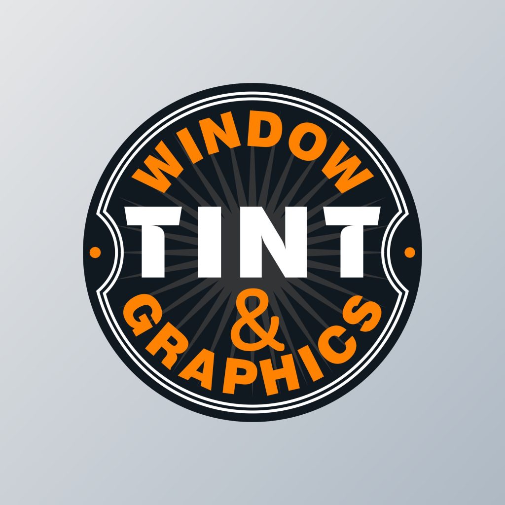
Window Tint & Graphics required a refreshed identity that could stand out in a competitive market while working seamlessly across signage, uniforms, and marketing materials. The new logo retained the recognisable orange-and-black palette, but introduced a circular system that brought cohesion and practicality. The sunburst element symbolises blocked sunlight, while the strengthened contrast on “TINT” ensures instant recognition.
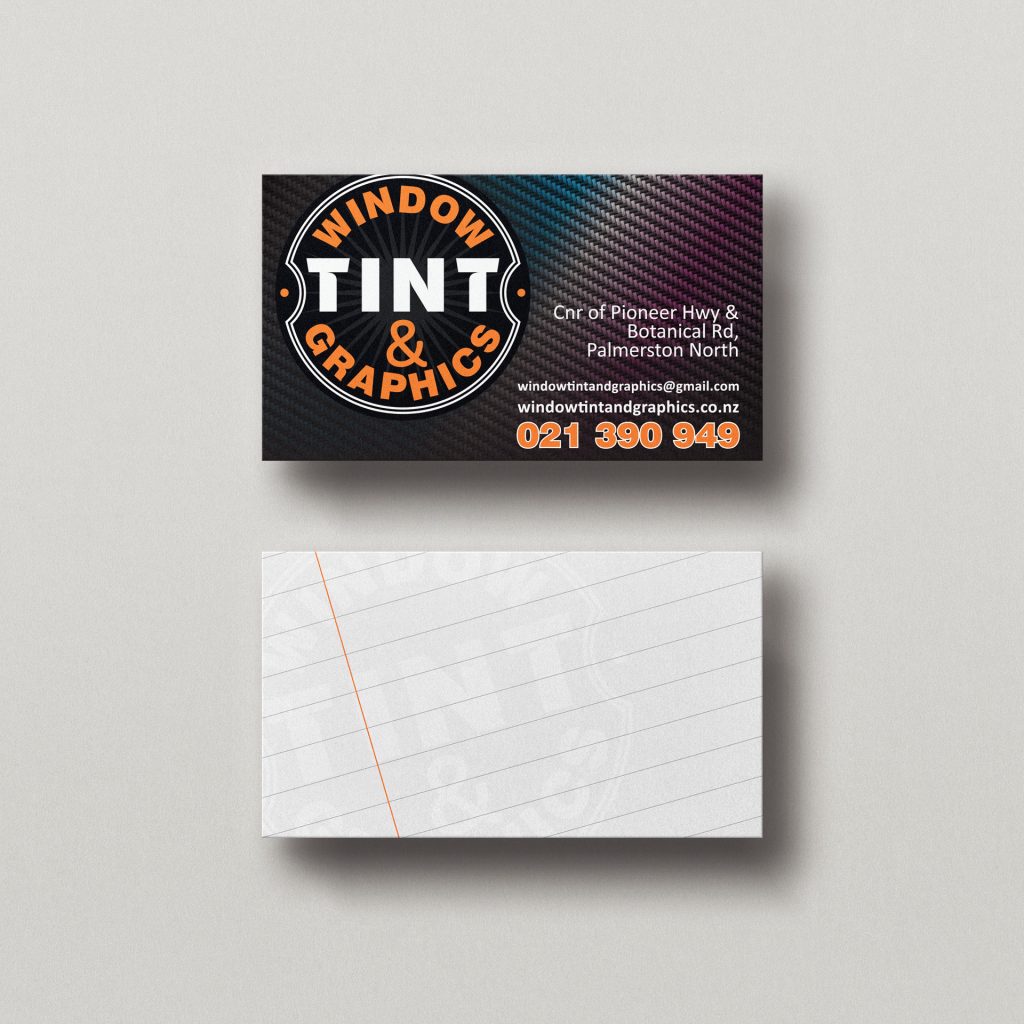
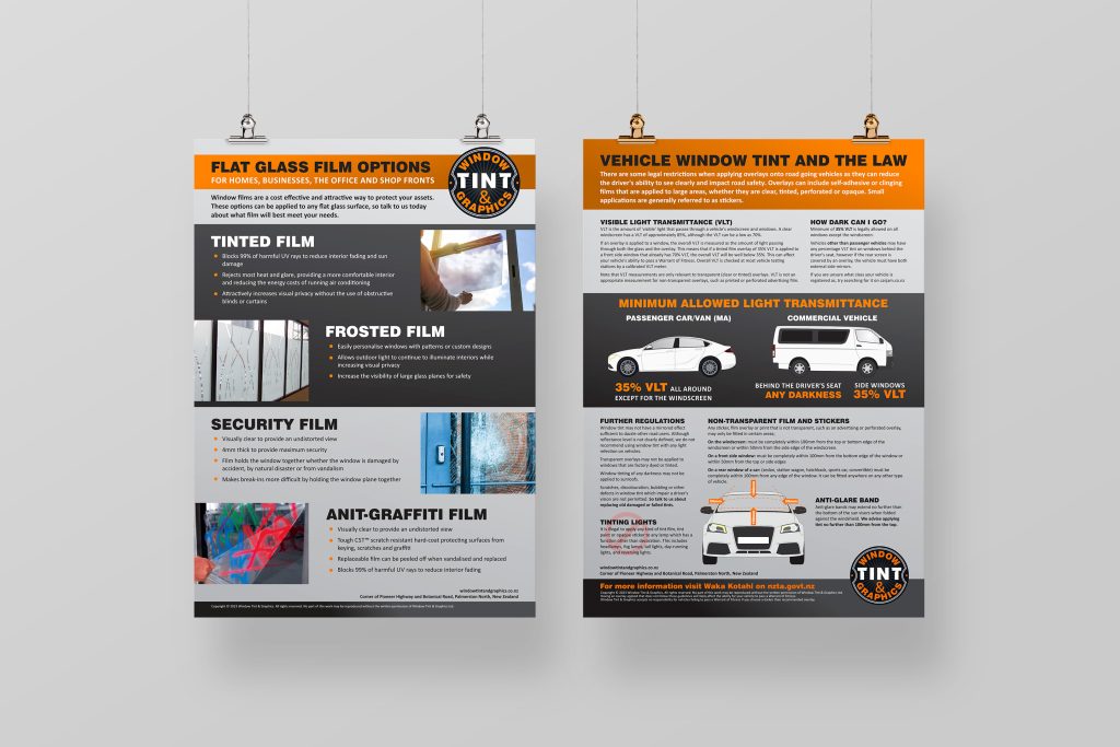
The redesign extended into business cards, flyers, posters, and uniforms, creating a consistent and professional presence. This elevated brand system not only modernised their look but also built greater trust at first impression, helping Window Tint & Graphics position themselves ahead of less polished competitors.
The refreshed brand identity gave Window Tint & Graphics a modern, professional look that built immediate trust with customers. A consistent visual system across all materials positioned them as the reliable choice in a competitive market, helping them win business over cheaper, less established competitors.
Services
- Brand Identity
- Logo Design
- Print Media
- Branded Stationary
- Webpage Design
- Social Media